Case Study 02
Revamped Group
"The offer was there. The journey wasn't."
Service Design · Journey Mapping · Conversion Research
Qualitative Service design, journey mapping
The work
Brand and service-experience design for a growing service business.
My role
Research, journey mapping, positioning, visual identity.
Objective
Find where prospects fell out between interest and commitment, then rebuild those moments.
The artifact
A customer journey map pinpointing drop-out moments, plus a unified visual system.

Observation
Revamped Group had a real offer and real demand — but the experience between "interested" and "committed" was a scattered set of touchpoints that didn't talk to each other. The brand looked different in each place a prospect encountered it, and at several points the next step simply wasn't obvious.
When I traced the actual path a prospect took — first impression, learning what's offered, deciding to reach out, and committing — the same thing kept happening: people stalled at the handoffs. Not because the offer was weak, but because each stage quietly asked them to figure out the next one on their own.
Hypothesis
The problem wasn't persuasion — it was continuity. My hypothesis: if every stage of the journey carried the same visual signal and ended by making the next step obvious, prospects would stop falling out at the seams, and the path to "yes" would feel like one experience instead of five disconnected ones.
A coherent journey would also do something the scattered version couldn't: make the business look as established as it actually was.
Decision
I rebuilt the experience as a single, continuous journey:
- One coherent visual system — a calm, minimalist identity that read the same at every touchpoint, so the brand never felt like a stranger from one step to the next.
- Designed handoffs — each stage ends by pointing clearly at the next one. No dead ends, no guessing.
- Restraint over noise — generous space and a quiet palette so the offer, not the decoration, carried the message — and the business read as established.
The Artifact
A service blueprint — the three-phase journey on top, and the layers beneath each step: what the client sees, what they're feeling, and the infrastructure running backstage to make it work.
One journey, three steps
One continuous journey, not three boxes
A clear-eyed audit of where the brand actually stands today.
The full transformation — positioning, identity, and the plan.
Ongoing strategic support as the brand keeps growing.
Intake & diagnostic questions; expectations set early.
Deliverables, systems, and milestones that move it forward.
Retainer cadence, check-ins, and recurring touchpoints.
Drop-out audit, stage by stage
Brand looked different everywhere — no recognition.
Unclear what's offered or what's included.
No obvious next step — prospect had to self-navigate.
Friction at the final ask; momentum lost.
One consistent identity across every touchpoint.
Clear, scannable offer — answers before questions.
Each stage ends pointing at the next.
A simple, confident path to "yes."
Drop-out points (Sage-deep) and the fix applied at each (Sage) — the seams where the journey used to leak.
The unified visual system
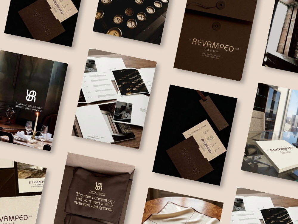
The unified visual system — calm, minimalist, the same everywhere a prospect meets it.
Outcome
Instead of five experiences that felt like different companies, prospects now move through one. The brand reads as established because it finally behaves like a system — and the moments where people used to quietly leave are now the moments that carry them forward.
What I'd test next
Instrument each handoff so the business can see which transition still loses the most people, then A/B test the copy at that single seam — the same drop-off thinking I built into Agathe's project, applied to a service funnel.
What this proves
- Journey mapping — followed one user across the whole path, not screen by screen.
- Service design — designed the handoffs, the part most brands ignore.
- Conversion research — located drop-out at the seams between stages.
- Systems thinking — one identity that built recognition across touchpoints.
- Design rationale — every choice tied back to continuity.
Reflection
What I learned / what I'd do differently
What I learned: people don't commit to high-trust services in one leap — the tiered path mattered more than any single piece of branding.
What I'd do differently: I'd instrument each phase transition to see where people actually drop off between Reality Check and Blueprint, so the model could be refined with real conversion data instead of assumptions.